 The yield on the 30 year bottomed at 3.55% on this chart in Aug/Sep and since then has been creeping up. The initial target of 39.25 (3.925%?) was met and we also have another active target to the upside of 4.225%. I've ignored the column of X's to the right of that target as the column of 0's next to it fell below the base of the X column at 37. The last column of X's which recently reversed in to that column of 3 0's has given an unactivated upside target of 46.25 (ie 4.625%)For that to become active, we need to see the yield move above that red horizontal line, filling the 40 box and remaining above that level. What has this move in yield done to the price?
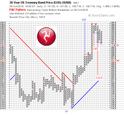 Well here's the answer. The price got as high as $136, so the activated target of $137 in July was pretty close. But it was unable to move higher and since then it has fallen by about 4.4%. The first active downside target of $130, given by the column of four 0's off the top is close to being met. But unlike the yield chart, we already have active targets to the downside with double bottoms and lower tops - that's the modified duration! You'll see the current column of 0's has just filled the box below the previous column of 0's, activating that target of $122, which would be 10.2% decline from the top.
 .
This may not play out because the 30 year is fair game for the Fed (after all, the P&F charts suggested equity markets were rolling over nicely in summer before the Fed planted the thought of further QE in the markets mind in September). But its what the chart is currently predicting!
No comments:
Post a Comment