Welcome to EV's point and figures. This blog is dedicated to the use of point and figure charts in technical analysis.

Although P&F first appeared in charts in the 1930's, it is an often overlooked techique for analysing stocks and charts. A poor relation compared to line and bar charts and their range of momentum indicators. Yet few charts provide a clearer picture of the daily battle between bulls and bears for market control.

Like most methods, it should not be used in isolation. It should form part of an analysts 'tool box' and be used with other techniques to help form an overall view.

The charts that appear on this blog and any accompanying comments are purely for information purposes only - my own personal take on where the prices may be heading. They do not constitute investment advice.

Wednesday, October 27, 2010

The NYSE Bullish Percent Index

I shall credit Tom Dorsey with his explanatory notes on this one.

Dorsey notes that market indices hide reality. Moves in a small number of stocks can drive the index higher. The bullish percent index assesses risk in the market, not performance.

It's a compilation of the percentage of (net) stocks on NYSE (1,831 at 26.10.2010) showing their first point and figure buy signal. Calculated weekly, each box represents 2% and the vertical axis runs from 0% to 100%.

If there are 1,831 stocks in the index and say 920 on P&F buy signals, the bullish percent is 50%. It only records the FIRST buy signal, all subsequent buy signals are not counted.

If the index had 100 stocks and over the next week 12 stocks experience a new buy signal and 10 stocks experience a new sell signal, that net 2% increase would fill an X box in a rising column of X's. In other words a 2% net change allows the chart to rise by one box.

Using the same 3 box reversal technique as for normal P&F's to shift columns in the index takes a (3x2%) 6% net buy/sell signal to cause a reversal and vice versa. As a rule of thumb, areas above 70% and below 30% are the extremes. Above 70% is over bought and below 30% is over sold.

'The names Bond....falling 30 year Bond'

Now I feel on slightly dodgy ground here as the long bond is an obvious target for the Fed's QE machine and they are naturally desperate to keep long term borrowing rates down. But this is the current picture and remember the concept of modified duration. Small movements in yield have proportionately larger movements in price. In the case of the 30 year its around 17% in price for a 1% move in interest rates.

The yield on the 30 year bottomed at 3.55% on this chart in Aug/Sep and since then has been creeping up. The initial target of 39.25 (3.925%?) was met and we also have another active target to the upside of 4.225%. I've ignored the column of X's to the right of that target as the column of 0's next to it fell below the base of the X column at 37. The last column of X's which recently reversed in to that column of 3 0's has given an unactivated upside target of 46.25 (ie 4.625%)For that to become active, we need to see the yield move above that red horizontal line, filling the 40 box and remaining above that level. What has this move in yield done to the price?
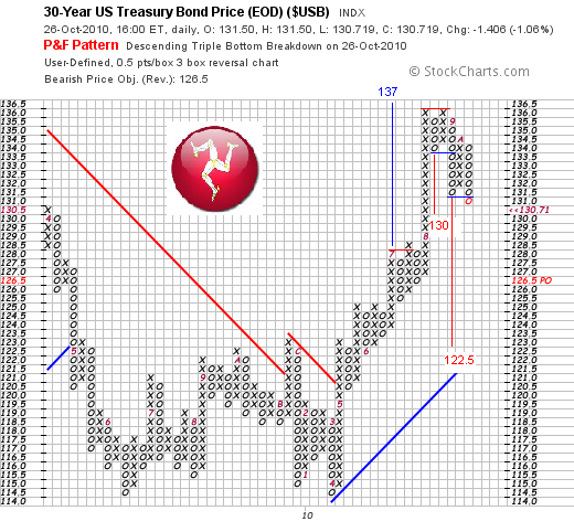

Well here's the answer. The price got as high as $136, so the activated target of $137 in July was pretty close. But it was unable to move higher and since then it has fallen by about 4.4%. The first active downside target of $130, given by the column of four 0's off the top is close to being met. But unlike the yield chart, we already have active targets to the downside with double bottoms and lower tops - that's the modified duration! You'll see the current column of 0's has just filled the box below the previous column of 0's, activating that target of $122, which would be 10.2% decline from the top.
.
This may not play out because the 30 year is fair game for the Fed (after all, the P&F charts suggested equity markets were rolling over nicely in summer before the Fed planted the thought of further QE in the markets mind in September). But its what the chart is currently predicting!


Tuesday, October 26, 2010

FTSE 100: 15 minute 5x3

From Proquote, not renound for the quality of their P&F charts but we'll give it a go. This 15 minute 5x3 hints of a double top. There is some previous support at 5,680 to overcome but we have an active downside target of 5595.

Friday, October 22, 2010

Petrobras (PBR): triple bottom sell signal

The upside target ($69) is still active. May see some support at $30, a previous support level. Triple bottom sell signal, with bearish resistance (red sloping line), active targets to downside of $23 and $12

S&P/TSX Mining Index - digging its way......higher!

Mining stocks led the recovery in stock markets - that was certainly the case with the FTSE 100 anyway. This index only tracks companies listed for at least 12 months on TSX, NYSE, NASDAQ.

Its interesting to compare this bigger picture with that of the Wilshire and Dow as I did yesterday. Some might argue that 'its all gold' and the of the 107 companies in this index 36 are indeed gold miners but their weighting is small - 17.7%. Diversified metals and mining is the largest weight -39 companies, 59.7% of the index.

Interesting to note that this index did not have an April 2010 high - it didn't have a March 09 low either, having reached its low in the back end of 08. It's recovery high came in Jan, three months before the mainstream equity Indices. It also looked like it was going to roll over perfectly until very recently but has now taken out the Jan high and (for now at least) appears to be well on its way to a rendezvous with its previous peak in May 2008.

Thursday, October 21, 2010

Wilshire 5000; similar perspective

Again, just a quick look at these charts show how important the April high is (to bulls and bears).

There has been some distribution recently on the 25x3 closing chart above, and we also have an unactivated downside target of 11,950. The current column of X's will need to reverse in to a new column of O's and move below 12,275 for this to become active. The three price objectives to the upside are all active. But remember these targets are for guidance, they do not always get met. Even here, although 325 points away, it has the 'look' of a double top.


Again, here is a bigger picture, 100x3 chart, showing the high of 2007 in the top left corner. The April 2010 high is of course the highest level the market reached from the 2009 bottom, before reversing. There is still an active downside target of 9,500 and an active target to the upside of 13,800. The horizontal red lines could form resistance levels showing previous highs before the market reversed (should also be one at the 13,300 level).


Dow perspectives: the double top case


These longer term P&F charts, showing the 100x3 close (above) and 50x3 close on the Dow Jones provide a bit more perspective. For now, it does indeed look like a forming double top. Remember, 100x3 charts require 100 points to fill one box and 300 points to reverse a column to the upside or downside, so can take time to form. This one goes all the way back to 2003.
To illustrate how important the April high level is, I have listed what I see as the 'active' price targets supported by the 100x3 chart. There are still multiple targets to the upside and currently only one active target to the downside (8,800). The 13,300 target created by the most recent column of X's is not active yet (and has not been placed on the chart).

If the index can punch above the April high and move through the red horizontal line, one would have to concede that the bulls are firmly in control. It would almost bring in to play the possibility of moving up towards the 'larger' double top rendezvous, back at the all time high of 2007.

We will know very soon how this will go.


Dow distribution? SPX about to?

Inagine the trauma suffered by people who jumped on the equity bandwagon in April, drawn in by the markets relentless push higher, wanting a piece of the action, then watching in horror as the markets rolled over and tanked big time! I wonder what their mindset is now that markets have got back up to those levels? Cut losses perhaps? Quit at breakeven maybe?


P&F charts are great at showing the daily battle between bulls and bears. Bulls have won the latest battle by a mile, as they did in April. The point is though, when markets get to certain levels, the bears come back in to the fray, as the bulls do when they fall to a certain level.

Back in April, the markets topped out progressively over a four to five week period, ie they distributed through April before the flash crash in May. This (25x3 closing) chart of the Dow shows that the bulls recent charge has been halted (for the time at least) by the bears entering the fray. If we get the sort of distribution pattern we had in April, it could last for 4-5 weeks, which would take us in to November before the battle ends, one way or the other. Could the mid term elections be a determining factor? We'll have to wait and see. But we need to see an impasse between bulls and bears over a couple more weeks. That may give those of a bearish disposition more encouragement that the bulls power is waning.

For the bulls, the markets are clearly showing a bullish bias at this time and that last column of X's has given an unactivated upside target of 11,825. A decisive move higher will bring this target in to play, above 11,150 and certainly above the previous high at 11,200.


The SPX is still playing catch up but again we have seen some sellers come back in, perhaps people who bought in April, have seen their paper losses narrow and are now cutting losses and heading for the sidelines. That said, for now at least all the active targets remain to the upside - a decisive move above 1,185/1,187 will stamp the bulls authority on this market.
In summary, if the markets are going to move lower, I would be looking for something to happen in November rather than now. It would be nice to see some more distribution with the bulls and bears scrapping in a tightish market range over the next two to three weeks.

Friday, October 15, 2010

Goldman Sachs - triangle wrecker!

This was the picture on 7th October, a nice potential triangle formation....


And here we are now. That pop to $155 has ruined my triangle and has also given a double top buy signal, having taken out the high of the previous column of X's at $152.5.
There is still potential for Golman to roll over - note the current level is where the first column of X's (that reversed the large column of O's down) reached before rolling over in August. In practical terms, this is a resistance level where sellers previously entered the market. For Goldman to push higher, we need to see this level overcome.


Wednesday, October 13, 2010

AAII Bullish Sentiment Index


Still, er, bullish!

FTSE 100 - hail to the bulls!


Now it may well not last and clearly these P&F charts don't show momentum indicators which will show how over-extended this and other indices are, but that aside there can be no denying that this rally, QE juiced or not has been impressive.

This is a 50x3 closing P&F chart so to get a reversal to the upside or downside, you need a 150 point movement. But just look at the recent movement - the current column of 12 X's is 600 points on the index, without interruption (the 25x3 chart shows an uninterrupted run of 22 boxes of X's without even a three box (75 point) reversal, thats 550 points up without being checked!!).
Even if you look at the price action in the second half of last year, we had a series of revesals and like several other indices, it looked like the FTSE was going to roll over in the summer until it reversed to the upside.

Resistance was hit twice at 5,400 but the FTSE has pushed on through that and we now have active targets to the upside of 6,000 and 6,150. The April high of 5,800 is only about 130 points away now so that will be the next test. One senses that it is going to require something similar to the April/May 'flash crash' to halt the FTSE's bullish stampede higher. The Emperor will have to reveal his lack of clothes to all!
.
Noting that some other indices (such as the FTSE Mid 250) have taken out their April highs, I guess if the FTSE could do similar one would have to start looking at the 'larger' double top, ie the 6,700 October '07 level. Preposterous maybe but just something to consider. And bear in mind too that if we had a three box reversal today, that column of 12 X's would be giving an unactivated upside target of 6,900!


Tuesday, October 12, 2010

Intel

Intel's 0.5x3 closing P&F. The current picture remains bearish, with an activated downside target of $13. Bullish support line is in place at the $16 level. To the upside, that $36 target (post the huge rally from $12-$20 from last year) is still in tact.

Lots of euphoria over Intel's Q3 earnings and Q4 margin outlook but in reality, sales of $11.1bn were at the top end of their own guidance (which in August was revised down from their previous range of between $11.2bn to $12bn). It's a spurious 'beat' of consensus forecasts. Lets see how the shares go over the next few days. A move below $17.5 would lend some weight to that downside target as it would create a lower column of O's than the previous column.

NYSE High/lows

I made reference yesterday to Joe Granville, who in his market letter had made reference to the performance of the Dow in the context of the broader market, referring to the '674 new highs in April'. I think he was referring to the NYSE.


The chart above shows the number of new stocks reaching a new 52 week high relative to the number falling to a new 52 week low.


The P&F chart above shows the NYSE number of stocks making a new 52 week high. As Granville suggests, this peaked back in April.


And this is the same data (ie number of new 52 week highs) but in normal chart form, log scale by the look of things.

Monday, October 11, 2010

Hang Seng: looking good but...

This is the 250x3 closing P&F on HSI. This (I think) is a 'diagonalised triple top' ie, not a pure triple top like the signal the Shanghai Index has given but two double top buy signals with a rising bottom (just to say the P&F language for double and triple tops is slightly different to that in candle and bar charts). Here a 'double top buy signal' is where one column of X's moves higher than the previous column. You can however (as with candle and bar charts) have double tops where the index gets to a previous high then moves back. The Dow is an example of an index where the P&F is moving up towards a double top)

Normally rising bottoms and rising tops is pretty bullish, but notice the black circle. We had this last year, then the market got to 22,750 and looked like it was going to roll over beautifully through H1 2010, only to confound the bears and move higher.

We are now back at that 22,750 level of previous resistance. A move to 23,250 (filling the 23,000 box) would (on balance) look pretty supportative of those activated upside targets. But can it punch through this resistance?

Shanghai (could) Surprise (to the upside)!


Here's a potentially interesting one to watch. The C in BRIC has not has a great year, down 14% in local currency terms and for a time moved back in to technical bear market territory but the Shanghai Composite appears to be on its way back up. Recent resistance has just been broken; twice the bulls were batted back at 2,675 but we now have a triple top buy signal, as the third column of X's has finally broken the previous resistance.

The activated upside target is 3,275, but the bulls will have to break through the red bearish resistance line looming above at the 2,970 level.
As i've said before daily closing P&F's are good for giving general direction but lousy for trading. Note how the 25x3 chart has only just given the buy signal at 2,700 while the market bottomed at 2,375. That's 13% of upside before this chart gave the buy signal! It might have been possible to use a smaller box size or hourly charts, for a better trading opportunity. That said, if it does get to 3,275, that's still 20% more potential upside from here.


Dow Jones: moment of truth approaching

Here is a 25x3 closing P&F on the Dow. That means each box is worth 25 points on the Dow and to achieve a 3 box reversal (creating a new column of 0's) you need to see a 75 point move down.

I would not normally go with 25 points on the Dow, as it's quite noisy in the context of an index worth 11,000 points. Ordinarily, a 50 point box size being the norm but the 25 pointer does work quite well here give a clear indication as to just how much power the bulls have had in the last 5 weeks.

It can be seen that from the support at 10,000, we had a strong reversal upwards, 16 boxes with a total value of (16x25) 1,200 points. We then had a 3 box (75 point) reversal, at which point the previous column of X's gave an unactivated upside target of 11,225 (ie 25x16x3 = 1200 plus 10,025). When the column of 0's reversed and the next column of X's passed through 10,450, that target became active.

Interestingly, this column of X's also ran to 16 boxes, or 1,200. We then had another three point reversal, and another unactivated upside target of 11,500. That became active when the column of 7 X's passed through 10,775.

And when that column of 7 X's reversed, we had an unactivated target of 11,200, which was activated by the current column of X's, passing through 10,875.

The points to conclude from this are the target given by the first column of X's from the base at 10,000 (ie 11.225) is getting very close. The column of 7 X's gives a similar target of 11,200. It all points to a double top rendezvous at the April high of 11,200, which is of course only 1.8% higher than where we are now. We will know very soon whether this short term bull has legs!


And one final point from Joe Granville, who was the father (!) of on balance volume. He says in his 'market letter' today of the Dow (quote):

''I'm most concerned with the Dow racing toward a widely non-confirmed double top with new stock highs sharply below the April 674 number (EV:that's the number of new highs in the broader market). This is bearish proof that most stocks are not following the Dow. ..We see the Dow knocking on the door of an approaching Double top with a far weaker current background'' (EV: than in April).

Friday, October 8, 2010

US Banks - the party poopers!

I love a good party me. The booze, the music, the 'craic' (pronounced crack) as the Irish say and the inevitable hangover the next day. But let's face it, every party has its resident pooper. You know the ones - while everyone around are enjoying themselves, they sit in the corner, not wanting to join in, won't let you chat them up, seemingly wishing they were somewhere else..!

The (Investment) banks that got bailed by the Fed not so long ago have been the party poopers of this latest market rally and is that a possible warning sign? Would they rather be somewhere else? Guess we'll soon find out.


Let's start with Goldman (2.5x3 close). Still caught in its triangle formation, can't break out up or down. It will resolve soon. Unactivated upside target of $200 required a close above $155, filling the $157.5 box. To the downside, there is an unactivated target of $102.5, requiring the price to fall below $135 to activate. All eyes on Q3 earnings and outlook i'd suggest!!


Bank of America, currently looking like a bit of a wreck to me. Granted, the rally off the bottom in 09 has been impressive but this has been steroids assisted and the chart appears to be rolling over with the bears back in control for now. If you 'flipped' this chart, you might be thinking 'double top' So i'm thinking a potential double bottom back down towards that target of $4, which is now active (remember where you first heard it!!)


CitiGroup, still looks like a dead man walking. Keen observers will also see one of the most obvious flaws of daily closing P&F charts. The conventional price targeting would give Citi a downside target of $0 based on that last column of 14 0's down!! For a stock at this level you'd really need to look at hourly charts, with a box size of an eighth or quarter perhaps.
Those of a bullish disposition could ask the question has Citi bottomed? Well, from $1 it couldn't go much lower and to be fair, that last column of X's has given an upside target of $12, which will become active should the price reverse up and we see a new column of X's move through $6.


And finally it's interesting to note that JPM, has probably been the one out of all four to have donned its party rags, joined in the recent fun and not pooped as much as the others. Currently stuck in a $5 range between $36 and $41 (the support at $36 twice is clear for all to see) but that $5 to the upside from $36 did provide a tidy gain of 13%. So this $36 level is clearly important and needs to be taken out to get that downside target of $25 active.
There is also an unactivated upside target of $51which requires a reversal upwards and a column of X's taking out both the resistance level at $41 and the diagonal red bearish resistance line looming above.

Given the way the US markets rallied in September will it be a case of these banks joining the party just as everyone is leaving, or were they themselves the first to leave in a bad mood, sensing the party was about to end in dramatic fashion?? Or will the Fed's punchbowl keep everyone in an inebriated state of elevation through to Christmas?