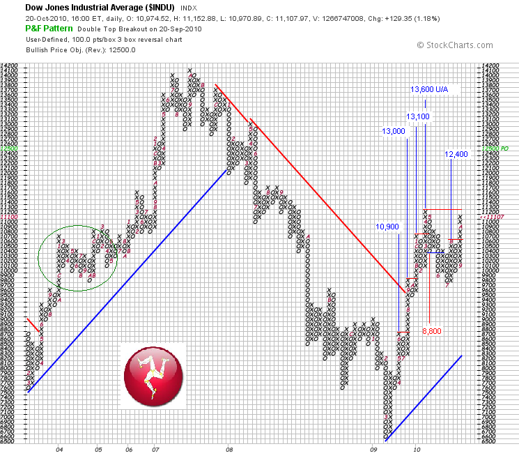
These longer term P&F charts, showing the 100x3 close (above) and 50x3 close on the Dow Jones provide a bit more perspective. For now, it does indeed look like a forming double top. Remember, 100x3 charts require 100 points to fill one box and 300 points to reverse a column to the upside or downside, so can take time to form. This one goes all the way back to 2003.
To illustrate how important the April high level is, I have listed what I see as the 'active' price targets supported by the 100x3 chart. There are still multiple targets to the upside and currently only one active target to the downside (8,800). The 13,300 target created by the most recent column of X's is not active yet (and has not been placed on the chart).
If the index can punch above the April high and move through the red horizontal line, one would have to concede that the bulls are firmly in control. It would almost bring in to play the possibility of moving up towards the 'larger' double top rendezvous, back at the all time high of 2007.
We will know very soon how this will go.

No comments:
Post a Comment