Welcome to EV's point and figures. This blog is dedicated to the use of point and figure charts in technical analysis.

Although P&F first appeared in charts in the 1930's, it is an often overlooked techique for analysing stocks and charts. A poor relation compared to line and bar charts and their range of momentum indicators. Yet few charts provide a clearer picture of the daily battle between bulls and bears for market control.

Like most methods, it should not be used in isolation. It should form part of an analysts 'tool box' and be used with other techniques to help form an overall view.

The charts that appear on this blog and any accompanying comments are purely for information purposes only - my own personal take on where the prices may be heading. They do not constitute investment advice.

Friday, April 11, 2014

S&P 500 - confirmed double bottom sell signal


It's been a while, but we have a confirmed 'double bottom sell signal' on this SPX 10x3 H/L chart, confirmed by todays opening. SPX remains some way above its long term (dark blue) bullish support line and I have added an intermediate support line also in blue. Target given by the column of 5 '0's from the peak is 1,740.

QE has wrecked havoc on all kinds of chart analysis and P&F has not been immune - lets see how this plays out. There are still plenty of targets to the upside still in play but for now the bears have the ball.

Wednesday, July 10, 2013

NYSE and NYSE Bullish Percent Index

This index is calculated weekly and (on a PF basis) is a compilation of the percentage of stocks on NYSE giving a first time PF buy signal. Each box constitutes 2% and the vertical axis runs from 0-100%.  So in general terms, the higher the percentage, the more 'strength' in the index. Or new highs in the index are being supported by an increasing number of stocks moving to P&F buy signals.

Eg: 100 stocks in an index, 50 on new PF buy signals, bullish percent = 50%.

Changes in the index up and down can only come from the FIRST buy signal given off the bottom. That's what is recorded and all subseqent buy signals are not counted.

Eg: 100 stocks in an index, index at 50%
Over the next week 12 stocks give new PF buy signals, 10 give new PF sell signals
= a net 2% more stocks on buy signal
As each box represents 2%, a net 2% change allows the chart to rise one box.

You use the same 3 box reversal methodology as for normal PF charts, so here it takes a (3x2%) 6% net buy/sell signal to reverse a column upwards/downwards. As a general rule, areas above 70% and below 30% are the two extremes. Above 70% is overbought and below 30% is oversold.


This is worth keeping half an eye on. Note the recent recovery in the NYSE Index....


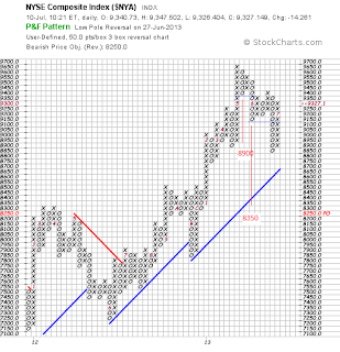
...is not currently being supported by any reversal to the upside in the bullish percent index, which has reversed from a recent high of 78%.
 
The active target of 8,350 remains in play (for now).  A move above 9,550 will kill it.

Tuesday, December 18, 2012

FTSE 250 Index - new intraday high


Not the clearest of charts it must be said (100x3 h/l). The FTSE mid 250 index posted a new all time  high today, taking out the intra day 12,282.2 on 22nd May 2007 - hooray! Currently 12,290 as I write.

The 100x3 chart shows that the Index has on two previous occasions reached this heady level (ie filled the 12,200 box - in May 2007 and more recently July 2011.  Anyone who 'bought the index' in July last year may be looking for an exit, so clearly an area of resistance bulls will need to overcome.

No arguing though its an impressive recovery from the 2009 lows.

Friday, December 14, 2012

Apple

 
Those earlier targets off the top were met, but the shares found support at the 510 level. There is a target to the downside of 380 that has been activated (as resolved by that traingle which eventually broke to the downside -the red coloured 'o's) but it would be more persuasive if Apple were to take out this 510 box, the level where it previously found support


Wednesday, November 7, 2012

FTSE 100 - topped out??


Seeing a lot of resistance on FTSE 100 at the 5,920 level, on both the daily and weekly charts. On the daily, it has struggles to push above that downward resistance line that formed from the 2011 top. And see how the support line from the June 2012 rally has become resistance, which the market was unable to push through this morning. 


The weekly below also showing strong resistance at current levels. The bulls need to push through this decisively to resume the bullish run but having failed to do so on all previous attempts, i'm wondering if we have seen the top for now.

Wednesday, August 15, 2012

VIX - gaps

See the gap between 13.90 and 13.75.


The gaps on the VIX consistently get filled. Likely this one will before the higher gap between 17.54 and 16.47


Friday, August 10, 2012

RUT - more upside to come

This 5x3 closing PF of the RUT 2000 suggests a bit more upside. The longer term (blue) bullish support line has not been broken. The target of 875 given from the recent low would challenge the May 11 high. We also have a more recent double top buy signal with a target of 845. This 845 figure is also corroborated on the same 5x3 chart but one that uses the 'high/low' technique.