Welcome to EV's point and figures. This blog is dedicated to the use of point and figure charts in technical analysis.

Although P&F first appeared in charts in the 1930's, it is an often overlooked techique for analysing stocks and charts. A poor relation compared to line and bar charts and their range of momentum indicators. Yet few charts provide a clearer picture of the daily battle between bulls and bears for market control.

Like most methods, it should not be used in isolation. It should form part of an analysts 'tool box' and be used with other techniques to help form an overall view.

The charts that appear on this blog and any accompanying comments are purely for information purposes only - my own personal take on where the prices may be heading. They do not constitute investment advice.

Monday, October 11, 2010

Dow Jones: moment of truth approaching

Here is a 25x3 closing P&F on the Dow. That means each box is worth 25 points on the Dow and to achieve a 3 box reversal (creating a new column of 0's) you need to see a 75 point move down.

I would not normally go with 25 points on the Dow, as it's quite noisy in the context of an index worth 11,000 points. Ordinarily, a 50 point box size being the norm but the 25 pointer does work quite well here give a clear indication as to just how much power the bulls have had in the last 5 weeks.

It can be seen that from the support at 10,000, we had a strong reversal upwards, 16 boxes with a total value of (16x25) 1,200 points. We then had a 3 box (75 point) reversal, at which point the previous column of X's gave an unactivated upside target of 11,225 (ie 25x16x3 = 1200 plus 10,025). When the column of 0's reversed and the next column of X's passed through 10,450, that target became active.

Interestingly, this column of X's also ran to 16 boxes, or 1,200. We then had another three point reversal, and another unactivated upside target of 11,500. That became active when the column of 7 X's passed through 10,775.

And when that column of 7 X's reversed, we had an unactivated target of 11,200, which was activated by the current column of X's, passing through 10,875.

The points to conclude from this are the target given by the first column of X's from the base at 10,000 (ie 11.225) is getting very close. The column of 7 X's gives a similar target of 11,200. It all points to a double top rendezvous at the April high of 11,200, which is of course only 1.8% higher than where we are now. We will know very soon whether this short term bull has legs!


And one final point from Joe Granville, who was the father (!) of on balance volume. He says in his 'market letter' today of the Dow (quote):

''I'm most concerned with the Dow racing toward a widely non-confirmed double top with new stock highs sharply below the April 674 number (EV:that's the number of new highs in the broader market). This is bearish proof that most stocks are not following the Dow. ..We see the Dow knocking on the door of an approaching Double top with a far weaker current background'' (EV: than in April).

Friday, October 8, 2010

US Banks - the party poopers!

I love a good party me. The booze, the music, the 'craic' (pronounced crack) as the Irish say and the inevitable hangover the next day. But let's face it, every party has its resident pooper. You know the ones - while everyone around are enjoying themselves, they sit in the corner, not wanting to join in, won't let you chat them up, seemingly wishing they were somewhere else..!

The (Investment) banks that got bailed by the Fed not so long ago have been the party poopers of this latest market rally and is that a possible warning sign? Would they rather be somewhere else? Guess we'll soon find out.


Let's start with Goldman (2.5x3 close). Still caught in its triangle formation, can't break out up or down. It will resolve soon. Unactivated upside target of $200 required a close above $155, filling the $157.5 box. To the downside, there is an unactivated target of $102.5, requiring the price to fall below $135 to activate. All eyes on Q3 earnings and outlook i'd suggest!!


Bank of America, currently looking like a bit of a wreck to me. Granted, the rally off the bottom in 09 has been impressive but this has been steroids assisted and the chart appears to be rolling over with the bears back in control for now. If you 'flipped' this chart, you might be thinking 'double top' So i'm thinking a potential double bottom back down towards that target of $4, which is now active (remember where you first heard it!!)


CitiGroup, still looks like a dead man walking. Keen observers will also see one of the most obvious flaws of daily closing P&F charts. The conventional price targeting would give Citi a downside target of $0 based on that last column of 14 0's down!! For a stock at this level you'd really need to look at hourly charts, with a box size of an eighth or quarter perhaps.
Those of a bullish disposition could ask the question has Citi bottomed? Well, from $1 it couldn't go much lower and to be fair, that last column of X's has given an upside target of $12, which will become active should the price reverse up and we see a new column of X's move through $6.


And finally it's interesting to note that JPM, has probably been the one out of all four to have donned its party rags, joined in the recent fun and not pooped as much as the others. Currently stuck in a $5 range between $36 and $41 (the support at $36 twice is clear for all to see) but that $5 to the upside from $36 did provide a tidy gain of 13%. So this $36 level is clearly important and needs to be taken out to get that downside target of $25 active.
There is also an unactivated upside target of $51which requires a reversal upwards and a column of X's taking out both the resistance level at $41 and the diagonal red bearish resistance line looming above.

Given the way the US markets rallied in September will it be a case of these banks joining the party just as everyone is leaving, or were they themselves the first to leave in a bad mood, sensing the party was about to end in dramatic fashion?? Or will the Fed's punchbowl keep everyone in an inebriated state of elevation through to Christmas?


Tuesday, September 28, 2010

Goldman Sachs: still triangle-ish!

I've been keeping an eye on Goldman Sachs, which I flagged up in early September as a possible forming triangle.

At first glance, (although the long and short term bullish support lines are undeniably in tact) this chart does not look particularly bullish. GS is nowhere near its pre-flash crash level of $182.5 and since that decline in April, the bulls efforts to push the share price back up have been thwarted on two occasions now. We had reversals at $155 and more recently at $152.5.

Its not a perfect forming triangle but we are reaching a point where the price should move out of this area. To the downside, look for support at $137.5 and $132.5. If these levels are taken out, that target of $102.5 comes in to play. The mega bearish price target of $32.5 is unactivated and will only become active if the price falls below the bottom of the column of 20 0's (ie filling a box below the $132.5 level). That sort of level sits more comfortably with the Prechter doomsday view of Dow Jones 1,000-3,000. As i've said before, these are just targets that may be achieved, You never know!!

To the upside, we have an unactivated upside target of $182.5. For this to be activated, we need to see the $155 box get filled, which would give a higher column of X's than the previous column of X's.


This was the previous observation on 13th Sept. Note that the shares got beaten down at the previous level of resistance, as denoted by the red oval.


And this from 7th Sept, when the idea of a possible forming triangle was flagged up.


Friday, September 24, 2010

Dow Jones: on the up!

I would not normally use 100x3 charts, as the 100 point box size strips out a lot of noise. They are good for big picture but clearly loads can happen in between.

This is the current picture on the Dow. All looks very positive. We need to see a break above that 11,200 line to give those upside targets a bit more credibility. Bears can take heart that that previous high has not been taken out.


What a difference 2 months makes. Back in July, this same 100x3 chart showed that on balance the risks were to the downside. The 50x3 and 25x3 charts are better for providing shorter term indications.


US Existing Home sales


Tuesday, September 21, 2010

Antofag vs FTSE 100

A stunning performance from Antofag since the lows of 2008 (see how the FTSE bottomed 3 months later). On a price relative basis, its rarely looked more expensive vs FTSE (or FTSE cheap, heaven forbid!)


AAII Bullish Sentiment Index - looking toppy!


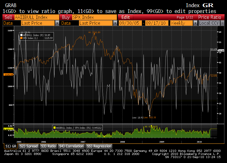
Sourced from Bloomers, this is the American Association of Individual Investors Bullish Sentiment Index, overlaying the SPX (apologies for the quality) from 2005. It measures the percentage of individual investors who are bullish, bearish or neutral on the stock market for the next six months. Not sure how many members are polled each week.

And here is the survey on its own.